The following graphics, from the New York Times, summarize the labor market changes nationally since 1980. They make very clear why Michigan and the Detroit Metropolitan area have had such a hard time, given this area’s concentration in two categories–skilled production workers and machine operators and assemblers. Both of these categories have declined precipitously, both in absolute and relative terms. The accompanying article is a useful explanation of the national trends.
NYT: Middle-class occupations have shifted
February 23, 2015Unemployment numbers decreased with the holiday season
February 23, 2015- From October 2014 to December 2014, the unemployment rate across the state and in the City of Detroit’s decreased (monthly);
- The Purchasing Manager’s Index for Southeast Michigan increased from November 2014 to December 2014 (monthly);
- Commodity Price Index decreased from November 2014 to December 2014 for Southeast Michigan (monthly);
- Wayne, Macomb and Oakland counties experienced decreases in the number of monthly building permits pulled.
 According to the most recent data provided by the Michigan Department of Technology, Management, and Budget, the unemployment rate for the state of Michigan decreased from 7.1 percent in October to 6.3 percent in December. During this same period, unemployment in the city of Detroit also decreased from 15.1 in October percent to 12.2 percent.

From November to December of 2014, the number of people employed in the city of Detroit increased by 1,775, leading to a total of 287,228 people employed in December.

The above chart shows the number of people employed in the auto manufacturing industry in the Detroit Metropolitan Statistical Area (MSA) (Detroit-Warren-Livonia) from December 2013 to December 2014. From July 2014 to November 2014 employment in this industry has increased by 9,000 from 91,600 to 100,600. However, from November to December, that number stagnated, remaining at 100,600. This was still the highest it had been over the last year.

The Purchasing Manger’s Index (PMI) is a composite index derived from five indicators of economic activity: new orders, production, employment, supplier deliveries, and inventories. A PMI above 50 means the economy is expanding.
According to the most recent data released on Southeast Michigan’s Purchasing Manager’s Index, the PMI for December 2014 was 64.2, an increase of 7.4 points from the prior month. As compared to December 2013, there has been an increase of 13.6 points.

The Commodity Price Index, which is a weighted average of selected commodity prices, was recorded at 54.2 points in December 2014, which was 7.6 points lower than the previous month and 1.9 points higher than December 2013.


The above charts show the number of residential building permits obtained each month in Oakland, Macomb, and Wayne counties from January 2013 until December 2014. These numbers are reported by local municipalities to the Southeastern Michigan Council of Governments and include single-family units, two-family units, attached condos, and multi-family units.
Oakland, Wayne, and Macomb counties all experienced a decrease in the number of building permits pulled from November 2014 to December 2014. These declines are largely seasonal, due to weather. Only Wayne County issued more permits in December 2014 than it did in December 2013. Oakland County issued 131 permits in December of 2014, a decrease of 10 compared to November 2014 and a decrease of 18 compared to December 2013. Macomb County issued 31 permits in December 2014, 47 fewer than in November 2014 and 52 fewer than in December 2013.
Wayne County issued nine fewer building permits in December than November of this year; in total 52 permits were pulled. This is seven more than the number pulled for the county in December 2013.
Washtenaw County has highest percentage of foreign-born residents
February 16, 2015The U.S. Census Bureau defines a foreign-born person as “anyone who was not a U.S. citizen at birth. This includes respondents who indicated they were a U.S. citizen by naturalization or not a U.S. citizen. Persons born abroad of American parents or born in Puerto Rico or other U.S. Island Areas are not considered foreign born.”
In 2012, 12.9 percent of the U.S. population was foreign-born and 6 percent of Michigan’s population was foreign-born, according to American Community Survey. While no county in Southeast Michigan had a higher percentage of foreign-born residents than the entire United States overall, four of the seven counties in the region did have a higher foreign-born population percentage than Michigan.
We saw in a previous post that Oakland County had the highest percentage of refugee residents in the region in 2012. This post shows that Washtenaw County had the highest percentage of foreign-born residents in that same year.

As noted, Washtenaw County had the highest percentage of foreign-born residents in 2012. During that time, 11.4 percent of Washtenaw County’s population was made up of foreign-born residents. Oakland and Macomb counties, which had the largest refugee populations, were the only other counties in the region where more than 10 percent of the population was made of foreign-born residents. In Oakland County, 11.2 percent of the population was foreign-born and in Macomb County 10 percent of the population was foreign-born.
Monroe County had the lowest percentage of foreign-born residents at 2 percent.

We see above that much of the foreign-born population in Washtenaw County resided in and around Ann Arbor. Within Ann Arbor and portions of Scio, Pittsfield and Ypsilaniti we see that the foreign-born population made up 20 percent or more of the population. Throughout the rest of the county though, particularly the west side, the foreign-born population made up less than 5 percent of the population.


Wayne County, which had a foreign-born population of 7.7 percent, had both the municipality with the highest percentage of foreign-born residents and the lowest. The foreign-born population in Hamtramck made up 43.1 percent of the city’s population. Highland Park’s population was only made up of .4 percent of foreign-born residents.
Other municipalities throughout the tri-county region where more than 4 percent of the population was foreign-born were: Detroit (Wayne), Dearborn (Wayne), West Bloomfield (Oakland), Troy (Oakland) and Sterling Heights (Macomb).

In Detroit, where 5.1 percent of the population was foreign-born, the majority of these residents resided in and around Southwest Detroit. In Southwest Detroit, that neighborhood’s population was 47 percent foreign-born. Springwells, West Riverfront, Vernor, Chadsey, Hubbard, and Boynton were other Detroit neighborhoods where 20 percent of more of the population was foreign-born. As we learned in a previous post, much of the foreign-born people living in this area of Detroit are of Hispanic descent.
Opting-Out limits manufacturing employment opportunities for the transit dependent
February 9, 2015James Robertson, has been coined Detroit’s “walking man” because of his tenacity in earning a perfect attendance mark at his suburban factory job all while walking nearly 21 miles round trip from Detroit to Rochester Hills. Without a car, Robertson must hobble together a defunct set of bus routes, leaving him no choice but to walk most of the distance into the Detroit suburbs. This story is surely one of many in the Metro-Detroit are, begging the question: Why is the public transit system in the Detroit area far less than mediocre?
Drawing Detroit sets out to illustrate the issue and to discuss how allowing communities to opt out of transit service can limit employment opportunities and create a situation of economic injustice.
Below is a map showing the number of manufacturing employees reported to the 2012 Economic Census of the U.S. Census Bureau in 2012 along with the transit status of communities in Wayne and Oakland counties. Aside from the Detroit Department of Transportation, the only existing transit system that is close being considered somewhat regional is Suburban Mobile Authority of Regional Transit (SMART). SMART has bus lines that run throughout Wayne, Oakland and Macomb counties. In Wayne and Oakland counties municipalities have the option to either opt-in or opt-out supporting SMART, and therefor having it run through their community. In Oakland, the majority of communities-55 percent of 33 of 60- have opted out. In Macomb County, all municipalities support SMART; they do not have the option to opt-out. Because of this, they are irrelevant to the discussion.
Some critics of the Free-Press article on Robertson indicated that there has been little need for low-skill workers in Detroit and other poorer communities to travel into these opt-out communities for employment or otherwise, characterizing these suburbs as bedroom communities with limited job prospects for transit-dependent workers. A quick examination of the map below indicates this is a fallacy. Many manufacturing jobs have moved to the suburbs, following its workforce and also seeking out new facilities and campuses in unsettled areas. Opt-out communities including Oxford Township, Novi and Canton have in excess of 2,000 manufacturing jobs located in their boundaries; Livonia had 9,447 manufacturing jobs in 2012.

In total, 38,461 manufacturing jobs were located in opt-out communities in these two counties, representing 34.1 percent of all manufacturing jobs in the two-county area. Broken down by county, it is 29.6 percent (19,484 manufacturing jobs) of Wayne County’s manufacturing employment and 40.6 percent (18,977 manufacturing jobs) of Oakland’s manufacturing employment.
Median income provide different view of Southeastern Michigan
February 2, 2015Various blog posts drawing attention to the income disparities that exist throughout Southeastern Michigan have appeared on Drawing Detroit. This particular post though is more visual in its depiction of income throughout the region at the county and municipal levels. In particular, this post presents the 2013 median household income for the seven counties in the region, along with the municipalities in the tri-county region, in a cartogram form.
A cartogram is a geographic representation method that alters the area and shape of locations, while still preserving their spatial relationships, in order to demonstrate the relative relationship of a data feature. This method allows the cartographer to change the way the map is experienced visually, by applying weight to data, while also maintaining geographic relationships.

Of the maps presented in this post, the above map is the least skewed in terms of income in relation to the size of the counties. Livingston County, which had the highest median household income in 2013 at $72,359, appears only slightly larger than its size on a normal scale. There is also a noticeable difference in the size of Wayne County, which had a median household income of $41,138 in 2013. This was the lowest median household income of all the seven counties.


The above two maps truly highlight the income disparities in the tri-county region, particularly in Wayne County. In both maps, the Grosse Pointes stand out as having median household incomes above $80,001. Grosse Pointe Woods ($105,071) and Grosse Pointe Farms ($107,152) had the highest incomes in that area.
In looking at both maps we see that Detroit simply serves as a low-income small connector between wealthy municipalities like the Grosse Pointes and the Plymouth area. Because the size of a municipality in these maps is determined by relative median household income and not geographic size, Detroit, which is the largest city by population in the state of Michigan, does not draw the visual attention it typically would. It has been dramatically impacted by its low median household income of $26,325 in 2013.
Another notable municipality with a high median household income is Lake Angelus in Oakland County. Lake Angelus is only 1.6 square miles but in the above map we see that its median household income makes it larger (in the cartogram) than cities such as Pontiac, Detroit, Warren and Mount Clemens. Lake Angelus had a median household income of $163,393 in 2013.
Other municipalities whose size appears larger in these maps because of their median household income were: Bloomfield Hills ($147,969), Novi Township ($108,125), Plymouth Township ($86,217), Canton ($81,667), Northville Township ($97,161), Grosse Ile ($88,238), and Orchard Lake ($137,321).

The above cartogram looks at median household income in Detroit by Census Tract in 2013. Areas making less than $20,000 greatly outnumber those making $80,000 or more. Riverview, Midtown, Rosedale Park and Indian Village swell greatly due to their high median income, while areas like Palmer Park and Grandmont-Rosedale also increase in size at the expense of areas like Brightmoor, Briggs, Core City and Poletown.
By viewing a municipality’s size in relation to the median household income we are able to gain a better understanding of where higher household incomes are located in Southeastern Michigan. These maps show that much of the wealth in the region is located in the northeastern and northwestern portions of Wayne County and throughout Oakland County.
More affluent school districts in Southeastern Michigan have higher immunization waiver rates
January 26, 2015In recent weeks news has broken about outbreaks of diseases many have thought were eradicated. From a mumps outbreak in the NHL to a measles outbreak at Disney World-which has since traveled to at least seven different states-to whooping cough outbreaks and a measles outbreak much closer to home in Grand Traverse and Leelanau counties, we are seeing that these diseases are indeed making a comeback. Many believe these are outbreaks are because of the growing number of children not being immunized.
While there have been no such outbreaks as mentioned above, immunization rates do vary in Southeastern Michigan, with some school districts having rates lower than the minimum thresholds needed to prevent the spread of disease. This is problematic, as low immunization rates threaten herd immunity and puts both vaccinated and non-vaccinated individuals at risk.
What is herd immunity?
The phrase “herd immunity” refers to protecting a community from disease by having a critical mass of its population immunized. Rather than just protecting the person vaccinated, vaccines can protect the entire community by breaking the chain of an infection’s transmission. However, for this to be successful, a certain number of people have to be vaccinated.
Epidemiologists have determined a basic threshold for infectious disease transmission by calculating both a “basic reproduction number” (R0), which represents how many people in an unprotected population one infected person can pass the disease along to – basically, a single person with mumps can pass it along to between 4 and 7 non-vaccinated people, while a single person with the measles could pass it along to between 12 and 18. The higher this R0 value is, the higher the percentage of vaccinated people in the population has to be, in order to prevent the spread of these illnesses. Therefore, in order to prevent an outbreak of measles, for instance, in a school district, 89-94% of students would have to be immunized.
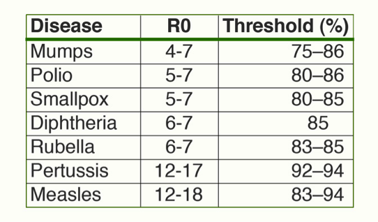
Photo credit © Tangled Bank Studios; data from Epidemiologic Reviews, 1993.
Furthermore, it is important for the population to be immunized in order to protect the health of those who cannot be vaccinated, such as infants and people with weakened immune systems. When large chunks of the community are not protected against these diseases, it is these groups of people whose health with be the most affected.
What are the immunization rates in Southeast Michigan schools?
Rates vary from well above minimum threshold numbers for even the most contagious diseases (Hazel Park and Southfield schools both have rates of 98%) to far below the threshold for any sort of protection (Madison Public Schools has the lowest, at only 70% vaccinated). However, it is important to note that not all school districts track vaccination rates uniformly – Inkster Public Schools, for instance, is reporting a 100% vaccination rate, but that’s based on an interview with a very small sample of students and may not be accurate.

Note: Data unavailable for Willow Run Schools (white area), as it was absorbed into Ypsilanti Schools this year.
One interesting trend present in the map is how more affluent districts seem to have lower vaccination rates than their less affluent counterparts, suggesting that non-vaccination is more of a trend in middle- to upper-income communities (although this certainly does not hold true for all). One important fact about herd immunity is that being vaccinated yourself (or vaccinating your children) matters less when the population isn’t immunized. For example, an unvaccinated student in Hazel Park would have less of a chance of catching a vaccine-preventable illness than a vaccinated student in neighboring Madison Heights, since it would be exceedingly difficult for disease to spread in a population that is nearly universally protected against it.
What is Michigan doing to boost vaccination rates?
As of January 1, 2015, the Michigan Department of Community Health changed their rules on obtaining an exemption waiver for vaccinations. Starting this year, parents will still have the right to refuse inoculations, but first they have to be educated by a local health worker about vaccines and the diseases they are intended to prevent, and sign a universal state form that includes a statement of acknowledgement that they understand they may be putting their own children and others at risk by refusing shots.
Currently, Michigan is one of 20 states that allow such an exemption. With this being the case, it was still easier to obtain a waiver here than it is elsewhere – for instance, Arkansas and Minnesota require a waiver form to be notarized, and Vermont requires parents who opt out to renew their waiver each year, instead of just for kindergarten, sixth grade, and in the event of a school transfer.
There is a definite correlation between the ease of getting an exemption waiver for vaccinations and the percentage of students who obtain waivers, as one study (Blank, Caplan & Constable, 2013) found that states with an easier process had waiver rates twice as high as those with more complicated ones. Therefore, by tightening these restrictions, Michigan’s vaccination waiver rates may decrease, and vaccination rates may increase.
Sources
http://www.pbs.org/wgbh/nova/body/herd-immunity.html
http://www.mlive.com/news/index.ssf/2014/12/vaccination_rule_change_propos.html
Blank, N.R., Caplan, A.R. & Constable, C. (2013) Excempting schoolchildren from immunizations: States with few barriers had highest rates of nonmedical exemptions. Health Affairs 32(7): 1282-1290. http://content.healthaffairs.org/content/32/7/1282.abstract
NYT: Lower wage earners hit the hardest by local, state taxes
January 21, 2015An article recently released by the New York Times shed light on a study produced by the Institute of Taxation and Economic Policy that shows how lower wage earners pay a large percentage of their income in local and state taxes than the middle fifth and 1 percent of Americans.
In Michigan, according to the study, the share of a family income of non-elderly taxpayers paid in state and local taxes was 5.1 percent. The lowest 20 percent paid 9.2 percent of their family income in state and local taxes, the second lowest 20 percent paid 9.4 and the middle lowest paid 9.2 percent. To learn more about who pays what in state and local taxes in Michigan click here. For the whole report click here.
Majority of Michigan’s refugees resettle in Oakland County
January 19, 2015In 2013, Michigan accepted the third highest number of refugees in the country, behind only California and Texas, according to the U.S. Department of the State. That year, 4,608 refugees entered Michigan; this represented 6.5 percent of all U.S. arrivals. The majority of refugees who relocated to the state made their home in Southeastern Michigan.
According to the U.S. Department of State, “a refugee is a person who has been forced from his or her home and crossed an international border for safety. He or she must have a well-founded fear of persecution in his or her native country, on account of race, religion, nationality, membership in a particular social group, or political opinion.”
According to the U.S. Department of Homeland Security the following individuals with the below immigrant statuses are eligible to enter and stay in the U.S. legally:
- Refugee
- Asylee
- Entrant
- Victim of Human Trafficking
- Those with a special Immigrant Visa


In 2013, 3,221 refugees relocated to a municipality within the seven counties of Southeastern Michigan. Of these counties, Oakland County received the largest number of refugees at 2,056. Following Oakland County was Macomb County with 871 refugees. Livingston, Monroe, and St. Clair counties did not have any refugees relocate within their boundaries in 2013. In total, 68 percent of all refugees who resettled in Michigan in 2013 came to Oakland, Macomb or Wayne counties. These three counties, along with Kent and Ingham Counties, are where 92 percent of refugees resettled in Michigan in 2013.
The majority of refugees who relocated to Southeastern Michigan in 2013 came from Iraq. Iraqis made up 99.7 percent of the refugees relocating to Oakland County, 99.6 percent of those to Macomb County, and 97.5 percent of those to Wayne County. Washtenaw County had a lower percentage of Iraqi refugee arrivals at 80.5%; Somalians and “other” made up the remaining 20 percent. The refugee populations that relocated to Kent and Ingham counties in 2013 were predominantly made up of people from Burma and Bhutan.
According to the United Nations Refugee Agency, Iraqis are the predominant group seeking refugee status in other countries, such as the United States, because of the armed conflict in their home country. Since 2003, according to the U.S. Committee for Refugee and Immigrants, about 43,000 Iraqi refugees have resettled in Michigan.

According to the U.S. Department of State, there was a 61 percent increase from the number of arrivals to Wayne County in 2012 (84) to 2013 (212). During that same time-frame, Macomb County experienced a 35 percent increase and Oakland County experienced a 19 percent increase. Of the four counties in the region where refugees relocated to in 2012 and 2013, Washtenaw County was the only county that experienced a decrease; there were eight fewer refugee arrivals in 2013 compared to 2012.
Additionally, just as experienced in 2013, in 2012 the majority of the refugee arrivals in the region and the state were from Iraq. Complete data was not available for 2014, however, through September 2014, the data shows that Iraq continues to be the country from which the majority of refugees who resettle in Southeast Michigan originate.
For 2015 though the United Nations Refugee Agency has stated that those of Syrian, Palestinian, Iranian and Turkish descent will be the most likely to seek refugee status. In September of 2014 U.S. State Department Spokeswoman Mary Warf said there were thousands of Syrian refugees who were referred to the United State for processing by the United Nations (World Net Daily).
Complete data was not available for 2014, however data through September 2014 again shows that Oakland County received the highest number of refugees and the country in which majority of refugees come from to resettle in Michigan is Iraq.
Number of vacant addresses in Detroit slightly decline
January 14, 2015The most recent (September 2014) quarterly statistics from the U.S. Postal Service show a slight decline in the total number of vacant addresses in the city of Detroit. The total number of vacant addresses (both residential and commercial) declined by 62 from 89,542 to 89,480 for the period July 2014 to September 2014. The total number of residential addresses declined by 455 from 362,342 to 361,887 likely reflecting ongoing demolition activity during the quarter. The total vacancy rate remained unchanged at 22 percent.


Best Performing Neighborhoods in Detroit (Green): Wayne State, West Canfield, Art/Cultural Center, Atkinson/Euclid. Lafayette Park, East Riverfront, Grandale, Cody, Rouge Park, University District, Rosedale Park, Palmer Park, Morang/Moross (St Johns Hospital area), Castle Rouge, Woodmere, Islandview
Worst Performing Neighborhoods in Detroit (Red): Tireman, Barton-McFarlane, Plymouth-Hubbell, Brightmoor, Schoolcraft, Mexicantown, Oakwood Heights, Denby (south of Morang), East Warren, Pershing, Kranz Woods, State Fair-Nolan
St. Clair County had highest percentage off of opposite sex unmarried partner households in 2013
January 12, 2015In this post we see that in 2013 the percentage of households comprised of opposite-sex unmarried partners ranged from 4.3 percent to 6.2 percent, with St. Clair County having the highest percentage. Additionally, there were more opposite-sex unmarried partner households in Southeast Michigan, than same-sex unmarried households in 2013. As shown in a previous post, no county had more than 0.8 percent of its households comprised of same-sex unmarried households was above 0.8 percent and no municipality’s percentage was above 3.7 percent.


Within the seven county region, Milan City in Monroe County had the highest percentage of opposite-sex unmarried partner households at 16.8 percent. The only other municipality within the region where more than 10 percent of the households were made up of an opposite-sex unmarried partners was Mussey Township in St. Clair County; 10.9 percent of the population lived in such a household.
As already noted, St. Clair County had the highest percentage of opposite-sex unmarried partner households at 6.2 percent; Oakland County had the lowest at 4.3 percentage. Within Oakland County, Hazel Park had the highest percentage of opposite-sex unmarried partner households at 7.8 percent. Oakland and Macomb counties were the only counties that did not have a municipality where 9 percent or more of households contained opposite-sex unmarried partners. In Wayne County, Gibraltar was the only municipality where more than 9 percent of the households were made up of opposite-sex unmarried partners (9.1 percent).Conway Township in Livingston County also had 9.1 percent of its households made up of opposite-sex unmarried partners; this was the only municipality in Livingston County where more than 9 percent of the households being made up of opposite-sex unmarried partners. In Washtenaw County, Ypsilanti had the highest percentage of opposite-sex unmarried partner households at 9.6 percent.


Although at the municipal level there were few communities where more than 9 percent of the households were made up of opposite-sex unmarried partners, at the census tract level we see that there were in fact areas throughout Oakland and Macomb counties where more than 9 percent of households were comprised of opposite-sex unmarried partners. In Oakland County, these areas were located in and around Pontiac, Rochester, White Lake and Ferndale/Hazel Park. In Macomb County, these tracts were in the areas of Chesterfield Township, Sterling Heights, Mount Clemens, Fraser, Harrison Township, Clinton Township, and Eastpointe.
Detroit, which had a percentage of 5.2 of opposite-sex unmarried partner households, had a large number of census tract with a high percentage of opposite-sex unmarried partner households.
